One Brand, Two Paths:

Loftness Clears the Way for Better UX

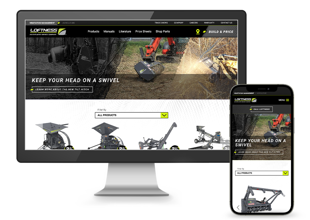
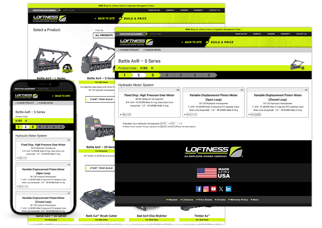
Loftness Manufacturing needed a more focused and user-friendly website experience to better serve two distinct audiences: Agriculture and Vegetation Management. Their previous site presented all products in one place, which created confusion and inefficiencies for customers with specific needs. Additionally, the site needed to function well on mobile devices, as sales reps often access it while in the field ... and sometimes literally in the middle of a field.

Loftness


To solve these challenges, we split the website into two clear sections, allowing each audience to engage with content tailored to their equipment needs. Within each section, we added callouts to product listings that highlight key features or compatibility details. These guided cues help users quickly identify the right product for their machine, streamlining the selection process.

Recognizing the importance of mobile usability, we implemented a mobile-first design strategy. Every page and feature was optimized for easy use on smartphones and tablets, ensuring accessibility for both reps and customers in any environment. We also completely redesigned the build-and-price tool to function smoothly on mobile. It now walks users through a step-by-step configuration process—focusing on one option at a time—and provides a final price, a clear call to action to contact a dealer and the ability to download or email a PDF summary.


Finally, we enhanced the dealer locator by displaying not only local dealers but also the appropriate territory rep for each region. This added context helps users connect directly with the right contact, improving the overall experience and reducing friction in the sales process.

In the end, Loftness gained a streamlined, mobile-optimized site that speaks directly to each of its core customer groups. The updates have improved user engagement, simplified product discovery and empowered both customers and sales reps with better tools in the field.